Teaching
TeachingTheWord Ministries is a local non-profit with a global reach and a mission of “equipping the scripture-driven church”. Their weekly email newsletter reaches more than 16,000 people worldwide. With such a broad outreach, the organization recognized the need for a refresh of their visual identity, complete with a new logo.
What I did
Sketching, Wireframing, Illustration, Web Design, Motion Graphics, Copywriting
Design Process
Logo Concept Sketches
I first met with the client and we discussed both the direction they wanted the visual identity to take, as well as the scope of the project and final deliverables. From there, I sketched several logo concepts based on our discussion; these sketches were then provided to the client for review. They liked the “shield and banner” concept the most, so I took to the computer and developed several variations of the initial design in Adobe Illustrator.

Illustration
The client then selected a final logo from among the variations, and I polished the design based on their feedback.

Typography
The client wished to retain the typography present in their existing logo, so I developed a modern look using the sans-serif typeface Adobe Lato.

Rationale
As a Bible ministry, the Biblical concept of armor - the sword and shield - resonated deeply with TeachingTheWord’s mission ideals. The secondary elements placed on the shield highlight their goal of equipping churches around the world with biblical truth, while the banner references their ministry verse, found in the Book of John.
Deliverables
Office Stationery
A huge part of TeachingTheWord’s ministry is their worldwide distribution of printed resources via mail. With the logo complete, I brought the design to all company stationery including letterhead, envelopes, packets, and pamphlets.


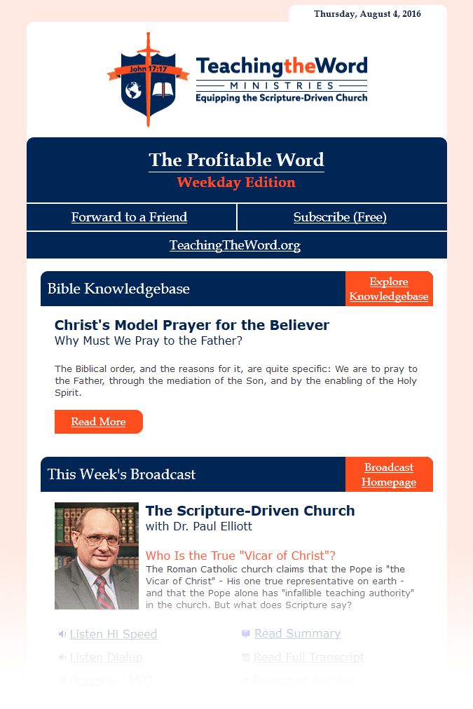
Email Newsletter
An equal half of my time with TeachingTheWord was spent developing a new email newsletter template within their email distribution service, ConstantContact. The newsletter was designed to match both the color palette and feel of the new logo/brand.

Style Guide
To ensure consistent usage of the new brand by individuals throughout the company, I was also required to develop a style guide that specified exact usage of the new brand and logo. The booklet was designed in Adobe InDesign where I compiled all the necessary graphics and wrote the specifications, then printed and spiral-bound in-house.


The style guide is also viewable for reference here: TeachingTheWord Style Guide 2016
Animated Logo
TeachingTheWord is actively becoming more involved in distributing new and different forms of multimedia. To ensure a consistent and professional presence of their new brand across all platforms, I developed an animated version of the new logo.
The modeling, texturing, lighting, and rendering of the animated logo took place entirely in Blender 3D. Featured in the video is the TeachingTheWord banner flying onto the screen as cloth and emblazoning itself neatly across the sword and shield. This effect was created by animating and rendering the entire logo sequence backwards and then reversing it, such that the cloth simulation started in its final position and a simulation blew it off screen in natural motion.
Accessibility note: I am currently in the process of transcribing the video located on this page and providing a descriptive audio alternative, per success criteria 1.2.1 and 1.2.5 of the Web Content Accessibility Guidelines 2.0. Until complete, this page only is not compliant with these guidelines. Thank you for your understanding.
Client Testimonial
David had to do a significant percentage of the work within the constructs of the Constant Contact marketing communications suite, and our web service provider’s content management system (NetMinistry Technologies). David was very adept in learning these tools, working within those constructs, while pushing the barriers of what someone else might have thought possible. As an added bonus, David helped us evaluate and give feedback on a new version of the Constant Contact toolset (we were part of their Beta program).
David laid both the technical and stylistic groundwork for us to build upon our re-branding program in the months ahead.
- Dr. Paul M. Elliott,
President, TeachingTheWord


