Roaming Wild Logo
Roaming Wild, a startup outdoor/adventure company, required a rugged, powerful, and versatile logo to represent and serve as the emblem of their mission to promote awareness of outdoor activities, conservation, and utilization of public lands.
What I did
Sketching, Illustration
Design Process
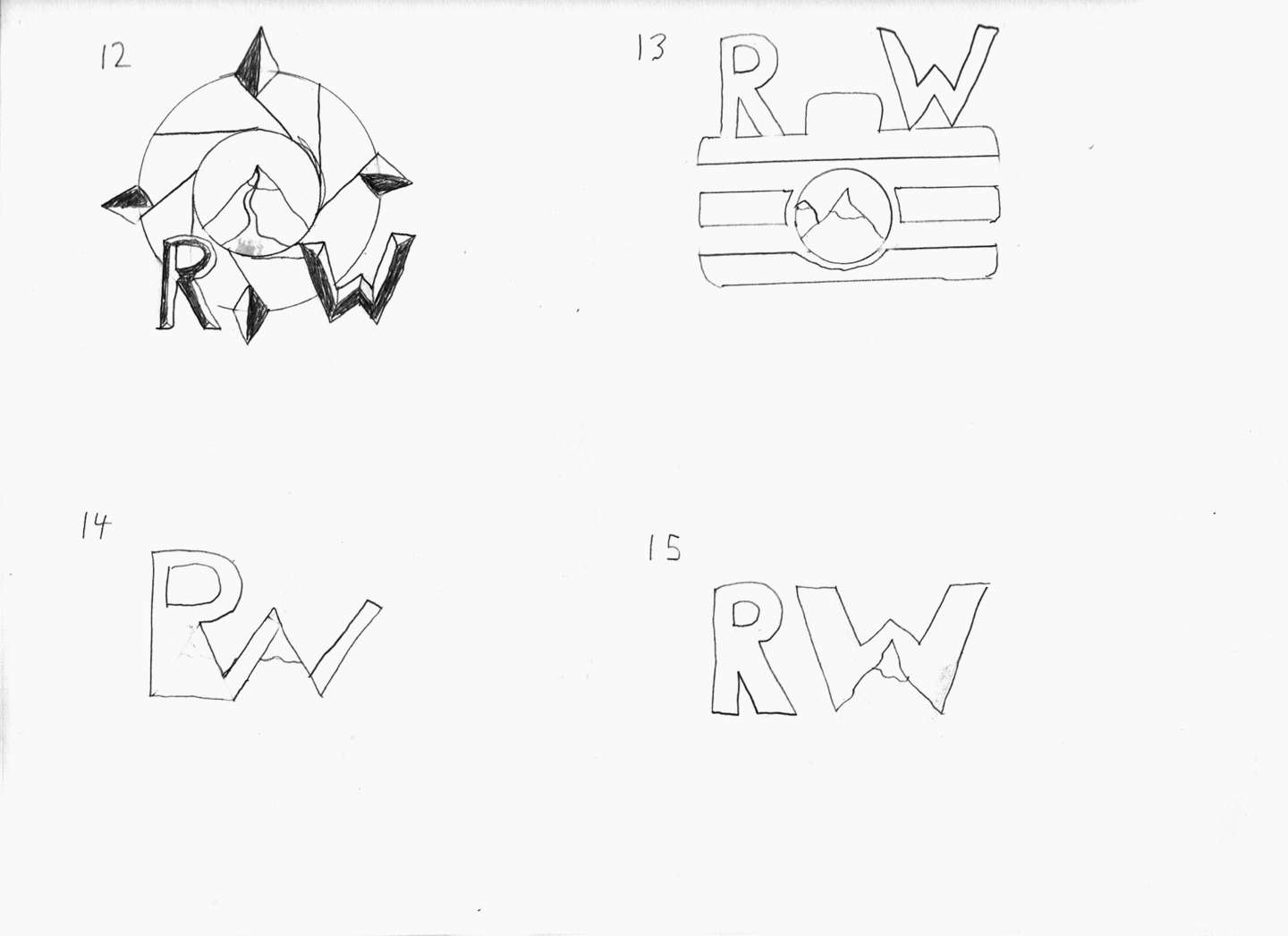
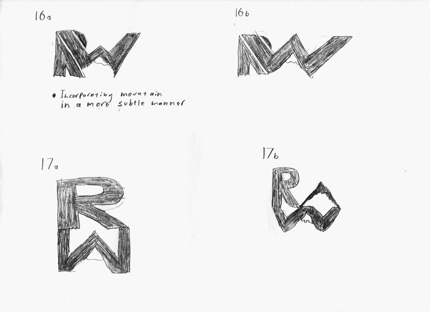
Concept Sketches


Rationale

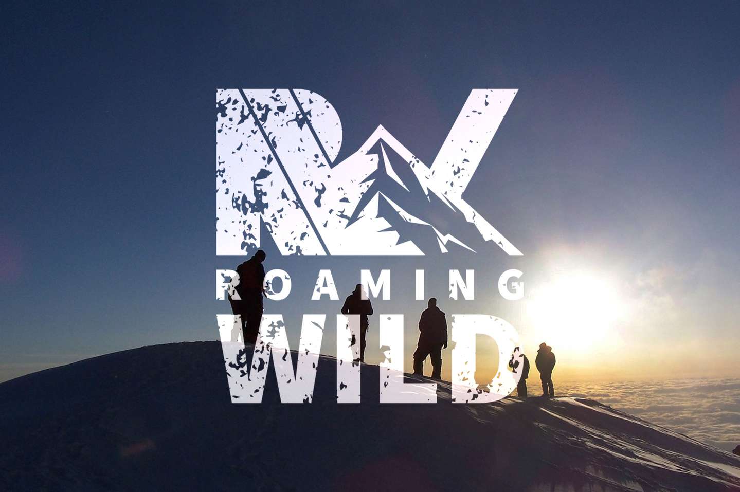
The RW logo mark meets this need by fusing the power and grandeur of a mountain with the company initials – a representation of the fusion of many anonymous individuals into a collective with a single goal: to explore and experience the great outdoors. Additionally, many interacting diagonal forms instill a sense of motion, a quality that functions as a call to action, while the subtle silhouette of a half hidden sun in the sky, the right “bowl” of the letter R, suggests an ongoing journey – that the best is yet to come.
![Roaming Wild logo on several products including shirts, jackets, and hats]](/img/portfolio/roaming-wild/rw-products_lg-1x.jpg )
Whether through hiking, skiing, hunting, or fishing, a unique quality of exploration is that it requires dexterity and versatility amidst ever-changing environments; consequently, Roaming Wild required a logo with equal versatility. To satisfy this necessity, the RW logo mark is designed to be exceptionally flexible – it can be reproduced in any color on any contrasting background, and with tactfully crafted simplicity, it can be recognized from distances at which it appears as small as a postage stamp. The logo typeface, Source Sans Pro Black, is simple and bold, and was chosen to reflect the values required of any tool of the outdoors, those being practicality and functionality.
Deliverables
The logo is available in two versions, one with a distressed grungy appearance and one without. The grungy version will be employed in most situations where retaining Roaming Wild’s rugged and weathered brand aesthetic is of the utmost importance; the clean version may be used as a substitute in situations where the grungy appearance may impede printing processes or legibility.
Client Testimonial
This design was completed as part of a competition-style college project for a real client in which ten students competed to design Roaming Wild’s new logo for use on their website and merchandise.
The design above placed 1st and was ultimately chosen as Roaming Wild’s new logo, which can be seen in use on their website, Roaming Wild Adventures. Below is feedback from the owners of Roaming Wild on the design and presentation.
[David] dressed ready to win the business. He made eye contact, shook our hands and thanked us for the opportunity. He was extremely articulate and [his] presentation skills were that of someone much more experienced and seasoned not only in design but in general business. He understands how to execute a vision, do excellent design work and follow it through [with] a great sales pitch without being over the top. He spoke to what very specific details in the design represented. Specifically, that the emblem should be proud and versatile. He accurately identified that the design should speak to a collective, call to action, people working as a team, a journey. He smoothly looped back initial words or vision that [my business partner] said to him during the first meeting.
He educated us to what will work and not work in certain situations. He explained that we needed to carry the identity without impeding the process. Specifically, where small sizes with the grungy lettering wouldn’t be clear. He provided details about printing processes. He followed that up with alternative solutions that [we] would like or other things we might consider. The fact that he took the time to place logos on items we might brand supported the idea that he understood our vision for not only the design but where we might take the organization. Finally he was the only one that discussed secondary branding elements. As an outsider, this was a key piece of education that I found helpful and can now envision using in clothing or other swag in the future.
-C & T,
Founders, Roaming Wild


